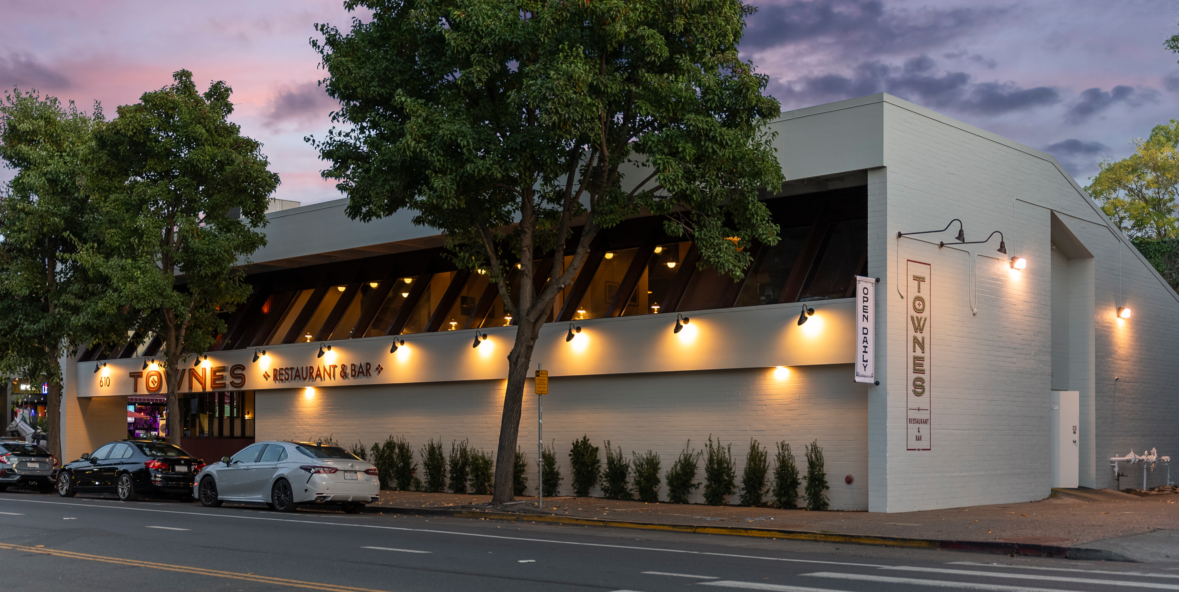
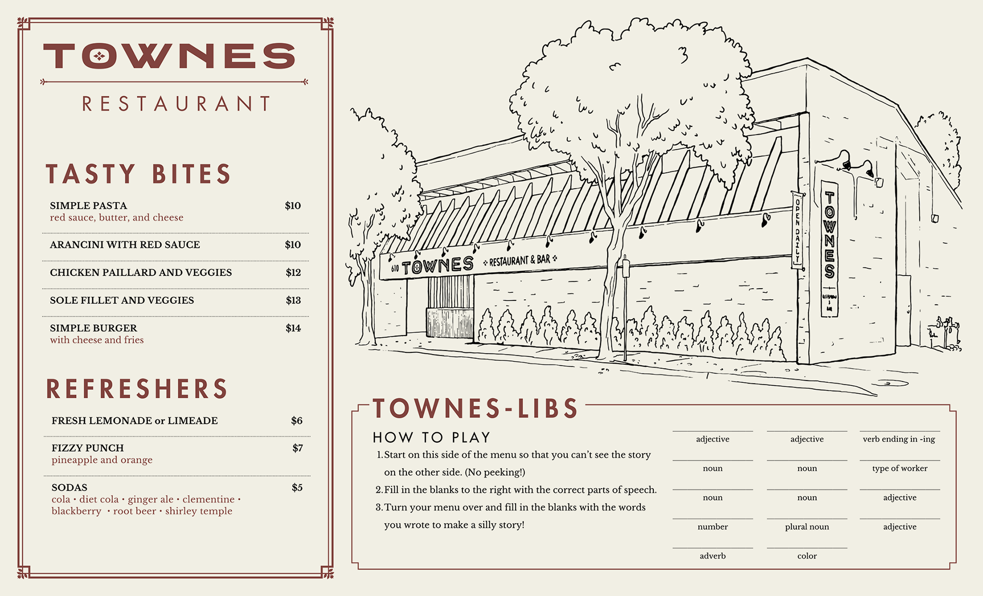
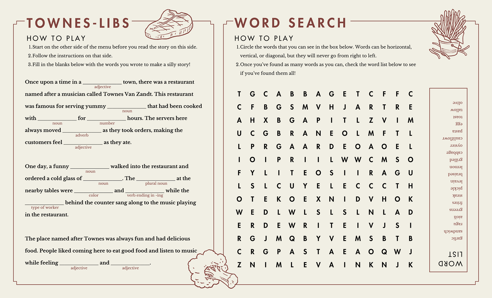
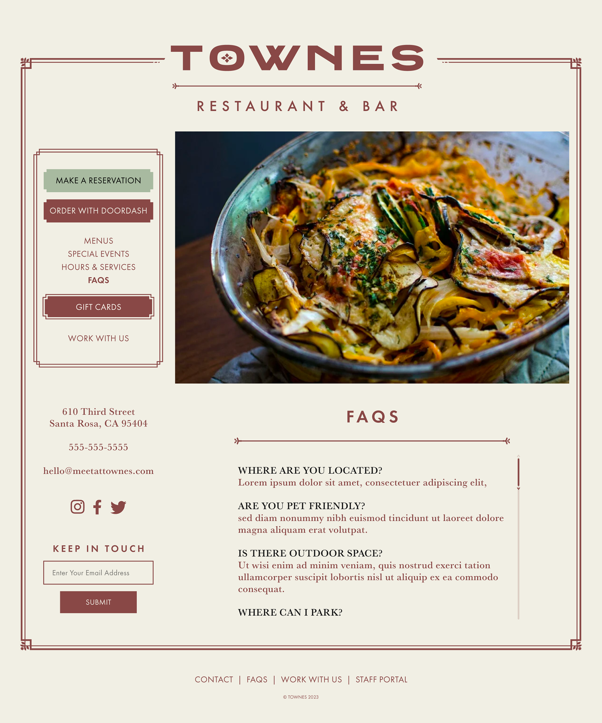
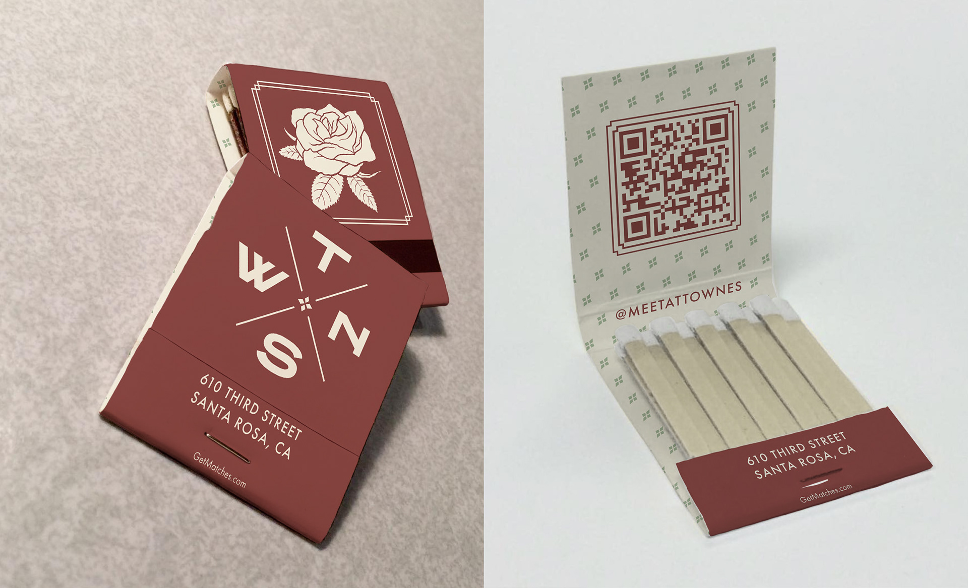
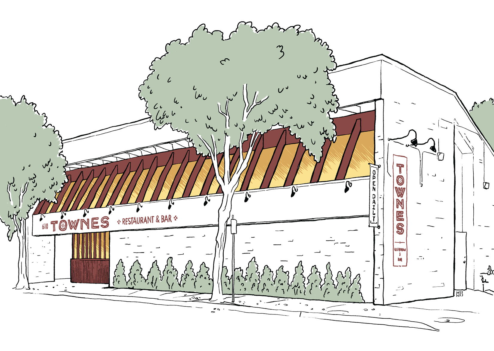
What started as a simple logo design project was expanded to include menus, web design, business cards, matchbooks, postcards, signage, and even framed art for the interior.
The aesthetic is meant to evoke the 1930s and working-class dignity; elegant but proletariat, drawing from stories of depression-era bootstrapping like Mildred Pierce.
The aesthetic is meant to evoke the 1930s and working-class dignity; elegant but proletariat, drawing from stories of depression-era bootstrapping like Mildred Pierce.
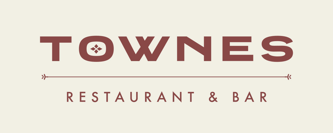
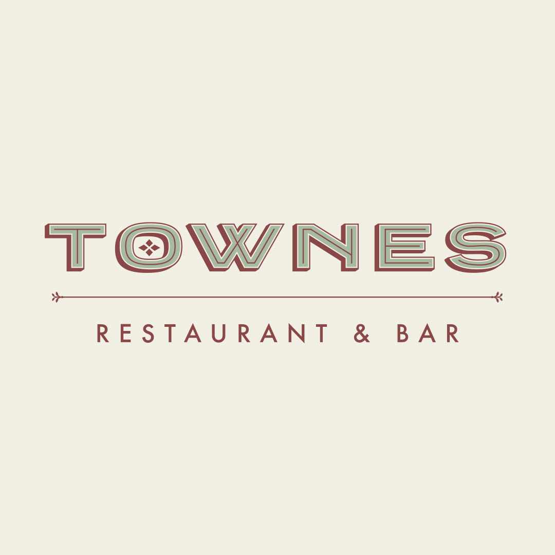
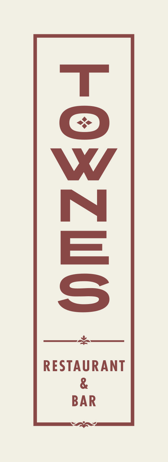
Logo & Secondary Marks

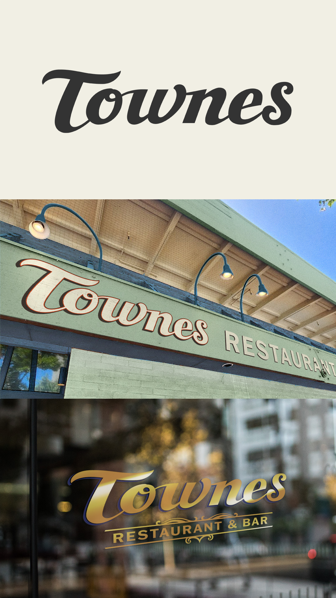
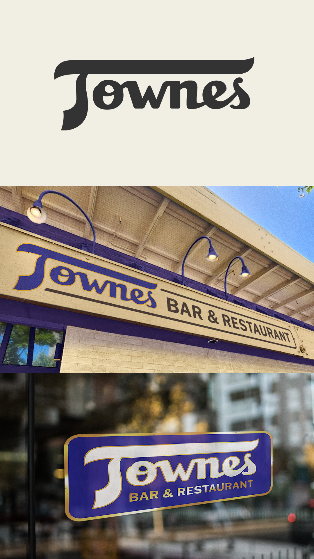
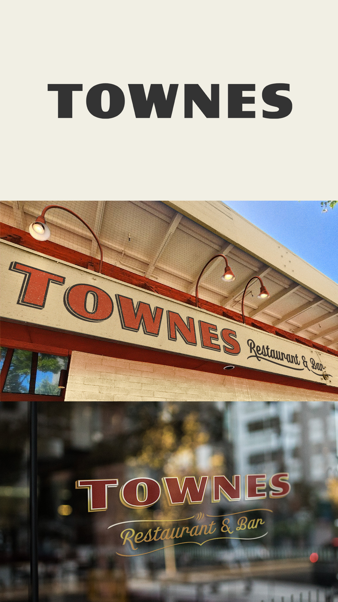
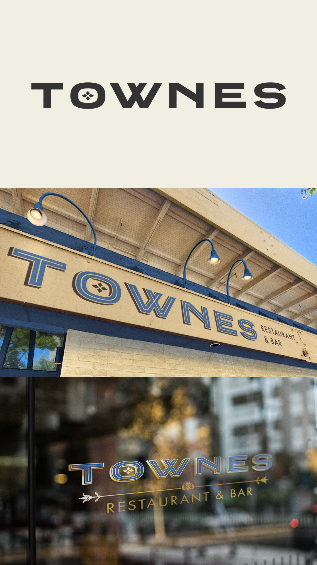
Early logo explorations included some more flamboyant options.
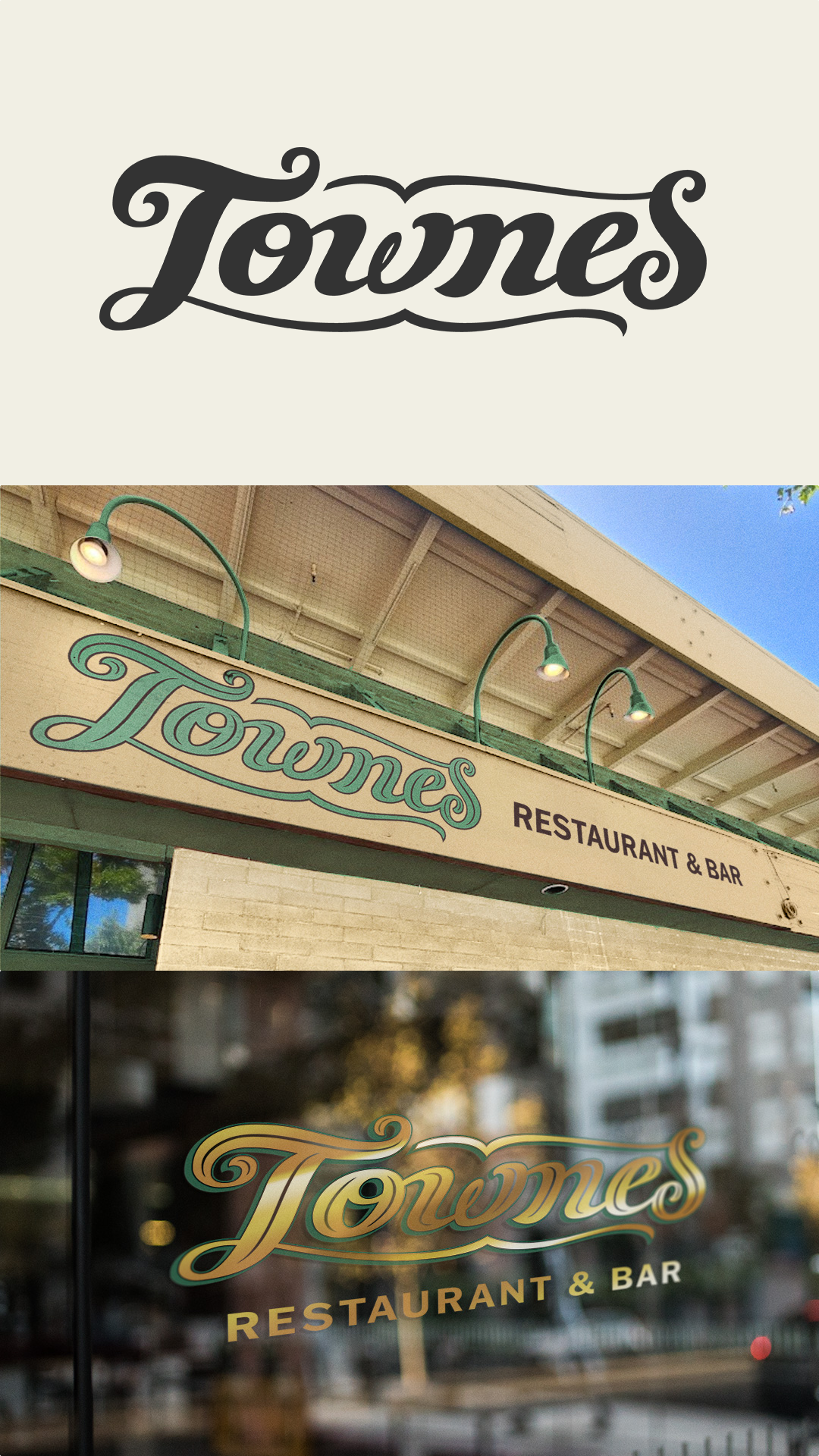
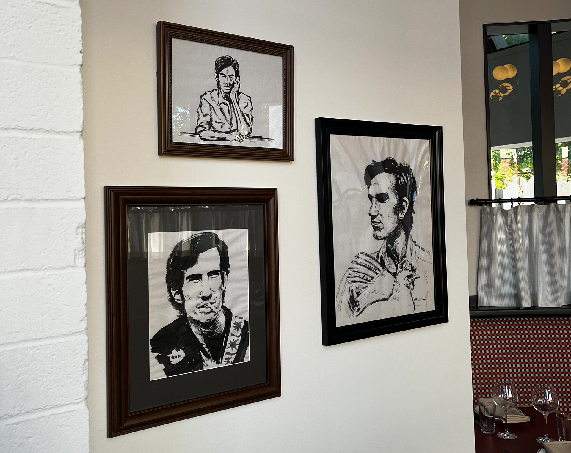
Ink portraits of the restaurant's namesake, Townes Van Zandt